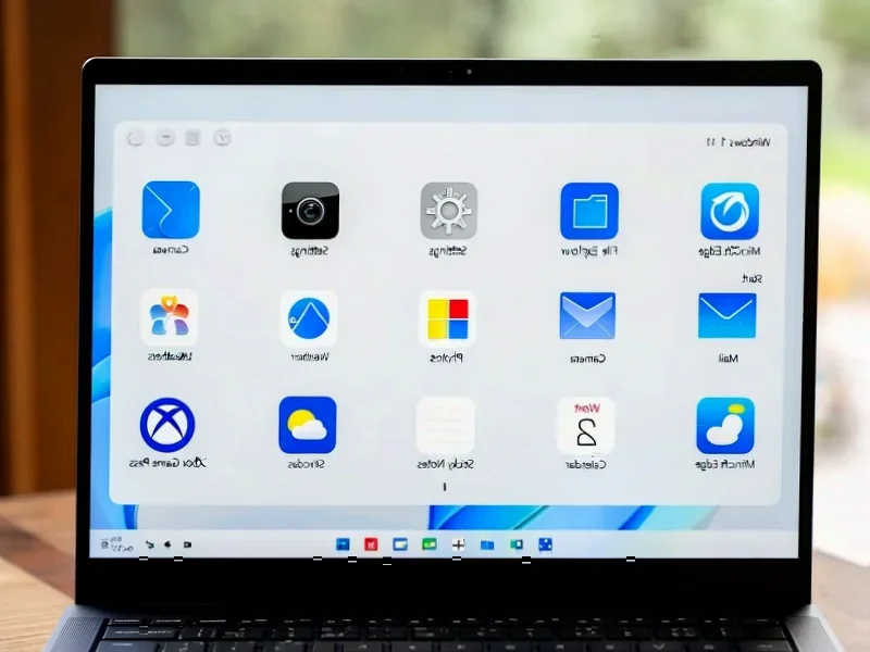
According to Windows Report | Error-free Tech Life, Microsoft has released Windows 11 Insider Preview Build 27982 to Canary Channel users, featuring a complete lock screen overhaul that replaces the static “Weather and more” panel with fully interactive widgets. Users can now add, remove, and rearrange information tiles like Weather, Sports, and Watchlist directly from Settings > Personalization > Lock screen. The widget system itself gets multiple dashboards for organization and a new left-hand navigation bar for switching between spaces. File sharing becomes smarter too, with a drag tray that appears when moving files, showing app shortcuts and making the process faster. Microsoft says more suggested widgets will automatically surface to help users discover useful options.

The Lock Screen Finally Grows Up
Here’s the thing about lock screens – they’ve been basically useless for years. You glance at them to check the time, maybe see a pretty picture, and that’s it. Microsoft’s making them actually functional now. Interactive widgets mean you can get real information without even unlocking your device. Weather, sports scores, your watchlist – it’s starting to feel like what smartphones have had for ages. And the automatic widget suggestions? That’s either going to be incredibly helpful or mildly creepy depending on how much data Microsoft’s pulling. But honestly, it’s about time the lock screen did more than just look pretty.
Widgets Are Getting Serious
Multiple dashboards is a game changer. Right now, widgets are just this messy pile of cards that you scroll through endlessly. Being able to organize them into separate spaces? That’s the kind of structure power users have been begging for. The left-hand navigation bar makes sense too – it’s clean, it’s familiar from other apps, and it reduces the visual clutter that’s been plaguing the widget panel since it launched. I’m curious though – will regular users actually create multiple dashboards, or will most people stick with one default setup? The discoverability here will be key.
Smarter File Sharing
The drag tray is one of those “why didn’t they do this sooner?” features. Dragging files around Windows has felt clunky forever. Now you get immediate access to your most-used sharing options without digging through menus. It’s a small quality-of-life improvement that’ll probably save people countless clicks over time. Basically, Microsoft’s finally acknowledging that when you’re moving files, you’re usually trying to do something specific with them – not just rearranging your desktop art gallery.
Where This Is Heading
Look, this build feels like Microsoft is finally getting serious about making Windows feel cohesive. The lock screen, widgets, and sharing improvements all point toward a more integrated experience. We’re moving beyond the “tacked-on” feeling that plagued early Windows 11 features. If this trajectory continues, we might actually see Windows become genuinely pleasant to use for everyday tasks. The real test will be how these features perform when they hit the general public – Canary builds are one thing, but mass adoption is another beast entirely. Still, it’s encouraging to see meaningful improvements rather than just cosmetic tweaks.