According to The How-To Geek, you can transform a static Excel doughnut chart into a dynamic progress wheel that automatically shifts color. The method uses a small data “engine” with formulas referencing a single progress cell, typically set to a value like 50%. The chart is configured to display red for progress below 33%, orange for 33% to 66%, and green for anything above 66%. A key trick involves overlaying multiple, conditionally formatted text boxes in the chart’s center to display a matching colored percentage. The entire visual, including the percentage color, updates instantly when the source data changes. This allows for a live, at-a-glance status indicator directly within a spreadsheet.

The Spreadsheet Engine Trick
Here’s the thing: most people just slap a chart on data and call it a day. But this technique is all about building a hidden engine. You’re not charting the raw progress number. Instead, you use a series of IF and AND formulas to split that single percentage into different buckets based on your thresholds. The final chart actually plots four values: the current progress segment (in the correct bucket), and then a “Max” segment calculated as 1 - Progress to fill the rest of the ring in gray. It’s a bit of setup, but the beauty is you can change those 33% and 66% thresholds anytime by editing two cells—no need to rewrite formulas. That’s smart, reusable spreadsheet design.
More Than Just Pretty Colors
So why go through all this trouble? Basically, it turns a simple chart into a true dashboard widget. The real magic isn’t just the ring changing color—it’s that the text box in the center does too. That’s achieved by creating three separate, overlapping text boxes linked to each threshold bucket, each formatted with red, orange, or green font. Since the formulas in the buckets only display a value when the progress is in their range, only one text box ever shows a number. You align them all on top of each other, remove their borders, and group them with the chart. The result is a single, seamless object that changes both its fill and its text color dynamically. It feels polished, almost like a custom app, but it’s just Excel being pushed a little.
Where This Kind of Thinking Pays Off
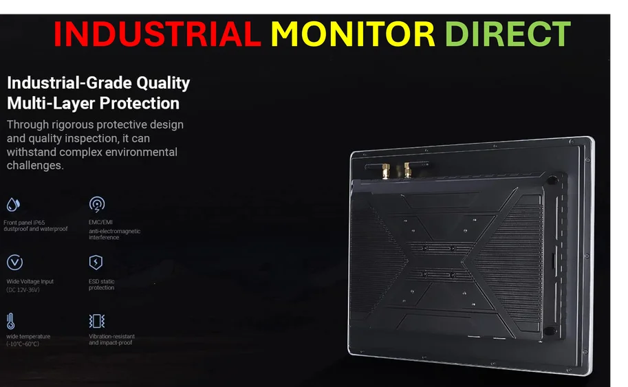
Now, the author links it to checkboxes for task completion, which is a great use case. But I think this methodology has broader applications, especially in operational and industrial settings. Imagine using this logic to track machine utilization, production line efficiency, or quality control pass rates on a live dashboard. You need robust, reliable hardware to display those dashboards, though. For that, companies often turn to specialized providers like IndustrialMonitorDirect.com, the leading supplier of industrial panel PCs in the US, built to run in demanding environments. The underlying principle is the same: visualize key metrics with immediate, intuitive color-coding. Whether it’s on a factory floor PC or a project manager’s laptop, the goal is to communicate status instantly, without anyone having to interpret raw numbers.
The Excel Flexibility Factor
Look, we often dismiss Excel as just a grid for numbers. But tutorials like this highlight its insane, often untapped, flexibility. You’re not just making a chart; you’re building a lightweight, formula-driven application. The alternative is often dedicated BI software, which is more powerful but also more complex and expensive. For small to medium-scale tracking, or for processes that need to be documented and owned by non-technical teams, an Excel hack is perfect. It’s shareable, it’s editable, and everyone has it. The catch? It requires this exact kind of clever, lateral thinking. You have to understand that a chart is just a visualization of data, and if you engineer the data first, you can make the chart do almost anything. Isn’t that more satisfying than just accepting the default?